 I'm really loving working on my Monument Valley paintings.
What an absolute perfect subject to portray with the primary colors. This time, I substituted Cerulean Blue for the Windsor Blue. Beautiful purples, but really hard to get a good dark. I finally relented, and just let the darks be what they are, and it's nice to see the ethereal dreamlike shapes come into being. I also decided to let the sky be a simple wash...helps with the "ethereal-ish" quality overall.
0 Comments
 This is one of my favorite 8 x 10" studies, created early in January.
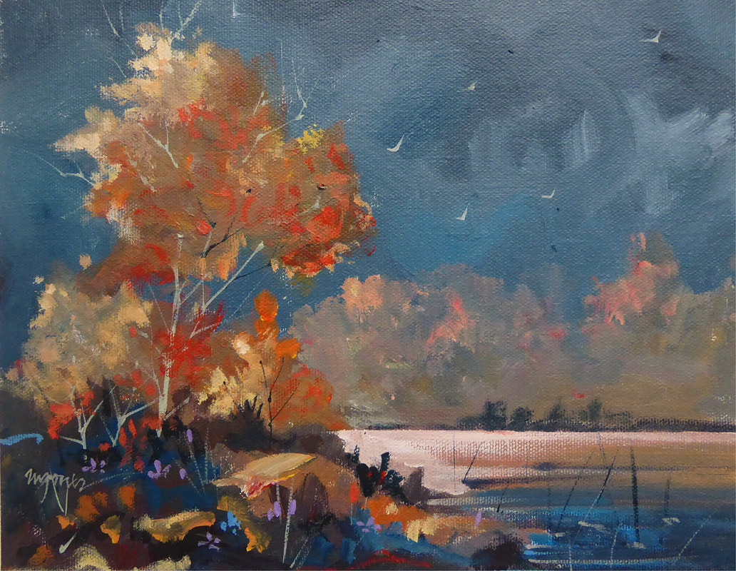
I love the foreboding feeling that comes with an upcoming storm while the sun still shines brightly in one last hurrah, before getting doused with wind and rain. Even the birds know what is about to happen, and scurry for cover. Here, the bright oranges co-mingled with the purples and blues in the foreground create a little tension as the storm moves in. I can smell the rain. 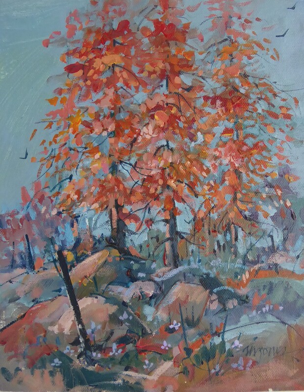 As is my wont to do, I love to paint the same theme multiple times with different color schemes and techniques.
Here, on the same day as the last Medicine Park, is Medicine Park II, again using the primary colors, but lightening the sky and working toward more pure color, substituting Carmine Red for the Cadmium Red used in the last painting.  Several years ago, I was the guest of a neat couple who had volunteered to house me as an artist in Lawton's Art for All Festival.
They had an incredible home in Medicine Park, near Lawton. While there, I wandered and sketched the giant granite boulders and oak trees, and have painted them many times. In fact, I painted this scene in oils a couple of years ago, and that painting is in a private collection here in Tulsa Today I painted this 8 x 10" acrylic study from one of those sketches. 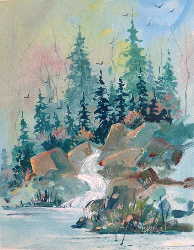 Here is an 8 x 10" study from sketches made north of Southfork, Colorado.
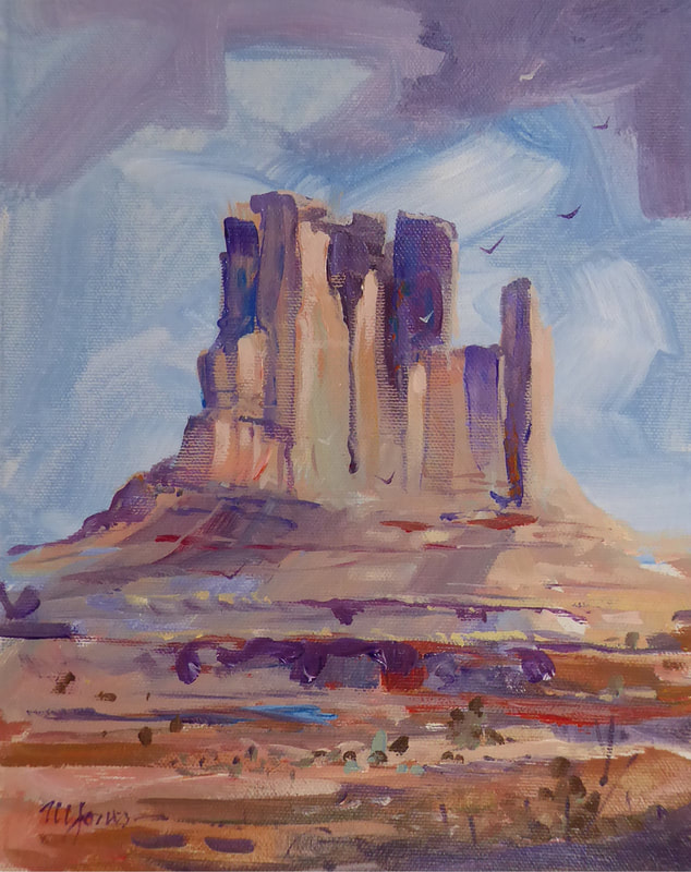
Yes I've taken some liberties with color and lighting, and loving working with only red, yellow and blue + white. Nice to put to practice the art theory that I've touted over the years with hundreds of students, namely, "you can make any color with red, yellow and blue". What do I love about it? The color scheme is harmonious and pleasing, plus it pushes me to THINK about color while I paint. 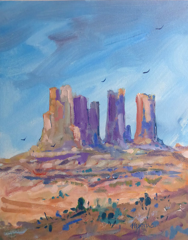 Here's a small painting from sketches I made at Monument Valley.
We headquartered at Mexican Hat, Utah. Damn, it was soooo hot. I hoped to paint on location, or at least at the motel but it was too hot. Monument Valley was incredible, but fairly crowded with tourists. Later, we drove through Valley of the Gods...just east of Mexican Hat. Virtually no one was there with the exception of a few "boondockers" who waved in a friendly way, but I could tell they hoped I would just move along. |
Micheal W. JonesThoughts and work from a mid-career artist working his ass off every day Archives
October 2021
My Facebook page and
Instagram page Categories
All
|
 RSS Feed
